ImmunoMind
A code-free analysis platform for biologists who shouldn't have to become programmers
Product
Biotech
Stage
Zero to one
Role
Founding designer


Learning a field before designing for it
Thirty hours before the first screen
Before I could design anything, I had to understand what these people actually do all day. Sixteen hours of lectures on immunogenomics, drug development and immunotherapy design. Eight hours of recorded customer development interviews. Six hours of sitting with the team on market specifics.
That sounds excessive for a design project, and it isn't. In a domain like this you can't run a workshop and hope the users translate for you — you need enough vocabulary to hear what they're not saying.
The tools in this field are built for machines, not scientists
Here's what a researcher works with today.

That's a modern tool, not a relic. In some products, biologists have to write code just to enter a command — and most scientists have no programming background, so they end up googling syntax between steps of their own research.
The pain points stacked up in a predictable way. Researchers juggle a different tool for every phase of analysis. The dominant ones demand R or Python. Interfaces favour novelty over usability. The field moves fast enough that tools go stale. And underneath all of it, constant cognitive exhaustion from jumping between three modes at once: the domain, the code, the statistics.
That last one turned out to be the real problem. Not any single tool — the jumping.
Mapping how scientists actually think
The mental model became the architecture
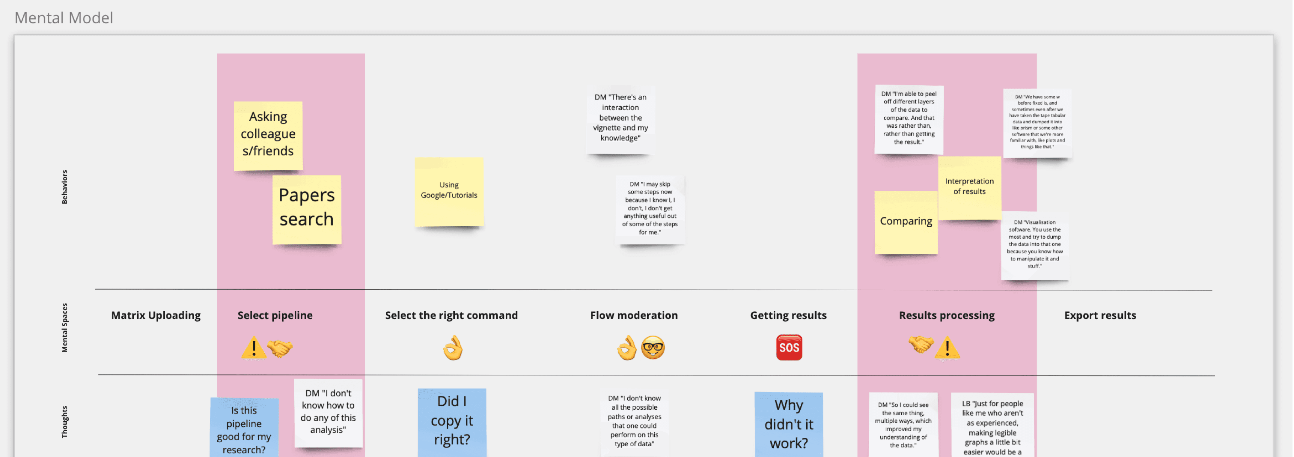
I turned the interview findings into a mental model map: every step a researcher goes through during analysis, what they're doing, and what they're thinking at each one. Quotes from the interviews sat under each stage, which kept the map from drying out into a diagram.
Then I marked each stage with how much the platform should intervene. Some phases need guidance — the user is unsure, and silence reads as abandonment. Others are the good part, where researchers feel expert and want to be left alone. Designing the same level of hand-holding across the whole flow would have been wrong in both directions.
That map became the information architecture more or less directly.
Four principles I could actually design against
Compartmentalize thinking. Separate spaces for separate cognitive modes, so the jumping stops.
Intuitive flow. Familiar scenarios and familiar terminology, even where the technology underneath is new.
Timely education. Knowledge arrives when it's needed for a decision, not upfront in a wall of documentation.
Foster confidence. Show every data source. In science, an unexplained result is a useless one.
The fourth one did more work than I expected. Researchers don't want an answer from a black box — they need to see how their data behaved on the way through the pipeline. Feedback from the first tests confirmed it: the journey mattered as much as the result, and I built the later iterations around that.
Designing for trust, not just clarity
What testing changed
We got the green light for user testing, and I spent three days building an interactive Figma prototype. The first sessions found complexity I hadn't seen from inside the design.
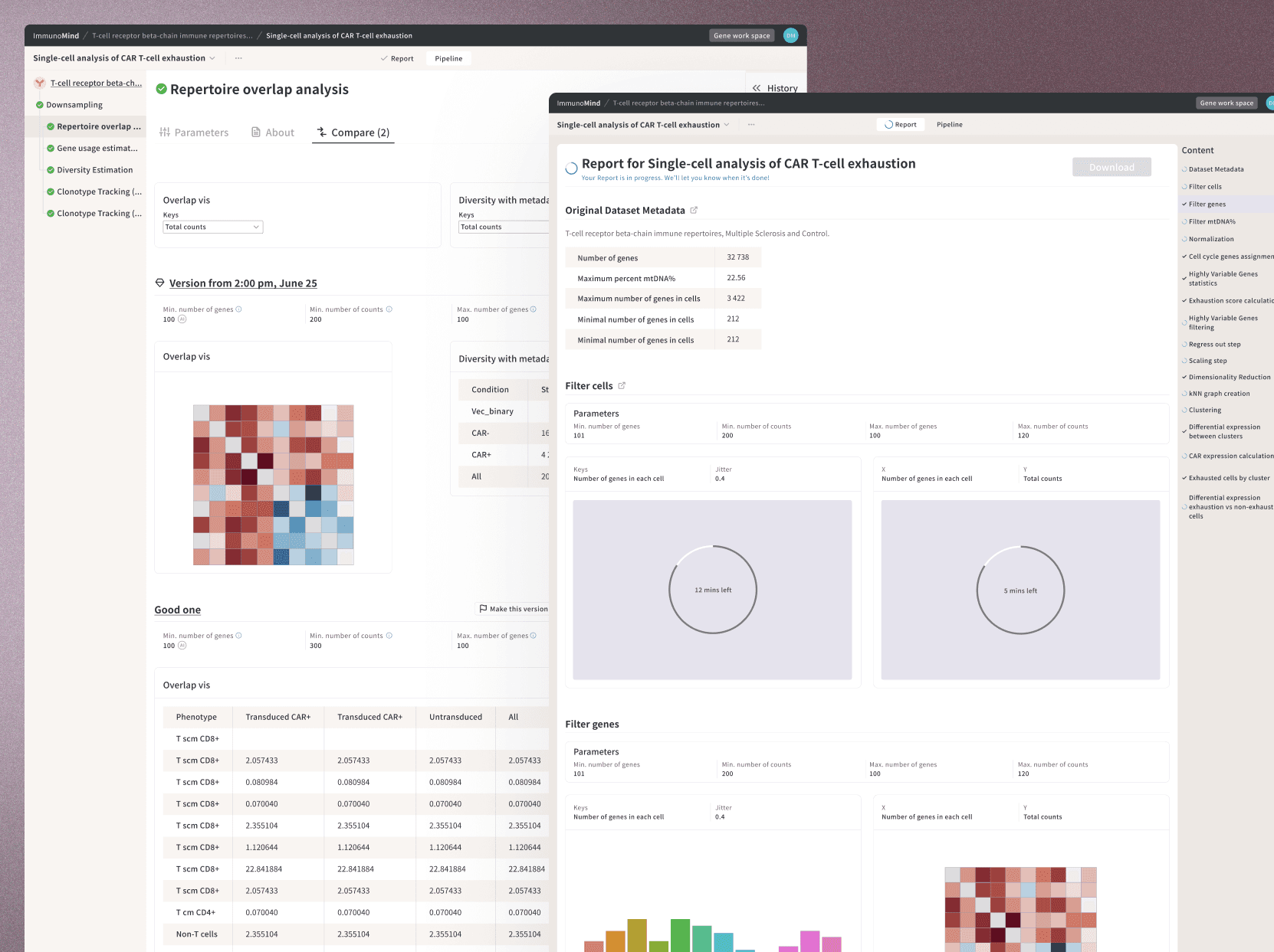
Four things came directly out of those sessions and stayed in the product: immediate results after upload, so the first interaction proves the thing works. A help guide available continuously rather than in an onboarding burst. Version history, so researchers could compare results across parameters — the way they actually work. And customisable charts, because scientists care what their outputs look like when they end up in a paper.

Warm on purpose
Biotech interfaces default to cold. Grey, dense, faintly intimidating — as if seriousness required it.
I went the other way: warm hues and rounded corners to counter the coldness people expect from AI, a modern visual language to signal that the technology is current, and clear shapes to carry expertise without shouting about it. The goal was a platform that felt like a colleague rather than an instrument panel.
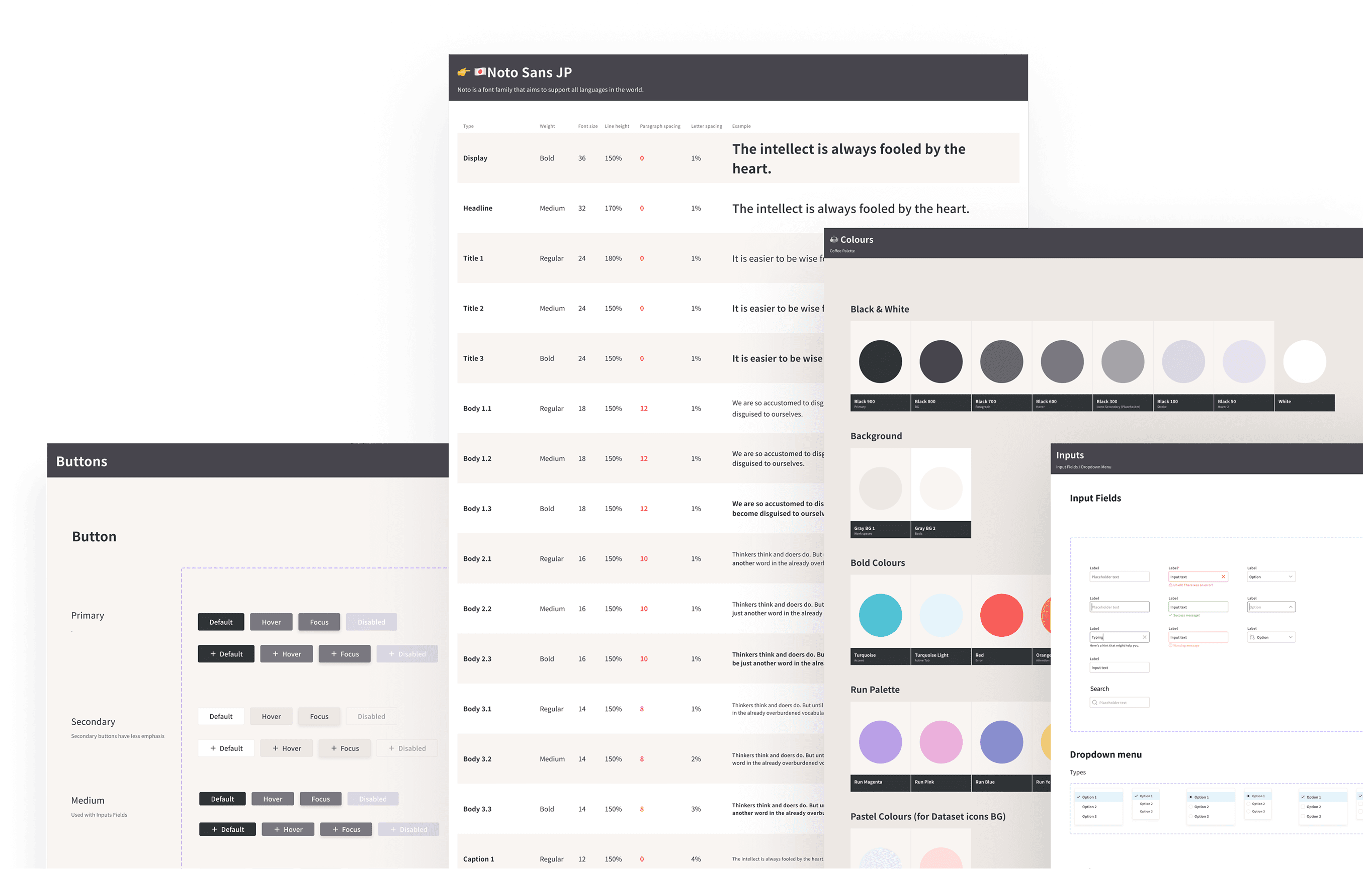
Then the design system, so it could scale past me.
Documentation as a design tool
I wrote content guidelines and an R&D content guide, and ran workshops on design philosophy for the team. Partly to close communication gaps, partly because in a domain this specialised, a copywriter needs to know how to write for a beginner without condescending to an expert.
Getting the team into usability sessions directly did more than any document, though. Watching a real user struggle changes an engineer's mind in a way that a spec never will.

Where it landed
All the qualitative findings fed a customer journey map with the main challenges flagged, and those moved into the backlog prioritised against business goals. No quantitative data yet at that stage, so I leaned on qualitative research and standard usability heuristics for complex applications, and said so plainly rather than dressing it up.
What I'd take from this one: deep immersion isn't optional in a specialised domain, and mental models are the cheapest way to convert what you learn into architecture. Also that designing for experts means respecting how much they already know — the job is removing friction, not simplifying the science.


